Thursday, 15 September 2016

School magazine and contents page


Evaluation:
                For a first trial of magazine making I'm fairly proud of how they look however, they lack professionalism and consistency. In my real covers, I want the images to be more creative and convey the genre  but also link together and look like they belong in the same magazine


Grids


Layout of magazines are important. If they are not clear or if they're aesthetically displeasing, people may be less likely to buy them. They have to be virtually the same in every magazine released or it will lack consistency. Grids help magazines get into order and also help to structure the magazine. However putting all the articles into standard format could be counter-productive as rigidity dulls the creativity. To avoid this, we can change widths and heights of margins and grids.

Here are some examples:

One column grid -


This is used very  rarely as the text can look boring and dull. The reader is also more likely to get lost trying to follow a small font with this kind of layout, however it leaves lots of white space for images to be placed especially if the margin is made much narrower.

Two column grid -


A two column grid is usually used for feature stories with lots of extra white space so the reader does not feel overwhelmed by the amount of writing. Also , if the margin is made narrower there may also be room for a few images.

Three column grid - 
 
A simple three column grid
This grid is fairly simple and easy to read on a magazine spread rather than a two column grid which would make the grids to wide for comfortable reading. Its usually used for long stories. Putting more important stories on fewer columns is best because this will give more importance to the story, it will look more elegant and the reader won’t have to jump to the next line of text so often. The text can also be broken up with images and pull quotes from the text.
An asymmetric three column grid could also be good to use although it is slightly more complex in terms of layout but looks more casual. It means more information can be separated and de-cluttered as to not overwhelm the reader into not wanting to read the article.


Tuesday, 13 September 2016

The Four F's


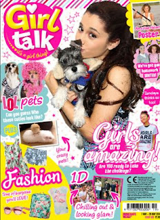
Format:     They are the design choices that are included in every issue to keep an overall consistency of the magazine. This includes colour scheme and font. For example, magazines aimed at young girls will most likely have pastel pinks and blues with doodles and sparkles all the way through the magazine and in every issue

For example 'girl talk'  has lots of pink and little doodles of love hearts and females on the cover which is featured in every single edition of the mag. (With exceptions to boy bands or actors that may be featured on the cover)


Formula: Editorial content (what's inside the mag) for example, article content, departments and their length. The address and the way the article is written will effect the audience. An adults magazine written like a child's magazine wouldn't work because people may think that the writer is insulting their intelligence and consequently the audience may lose interest in the magazine entirely and not buy it again.
 

As this example shows, its very clear just by the headlines which magazine is aimed at adults. The one on the right features mostly adult themes and cultures and is also mostly blocks of writing whereas the one on the left is much shorter and more fun and seems to be aimed towards the bands fans and young girls.
 

Frame: Margins and gutters are kept to a standard size to keep a familiarity and consistency in every issue of the magazine. The white space from the margins mean that it gives an eye break for the reader but also allows the reader to hold the publication without covering words. Without any white space at all the magazine would be very off-putting to the reader as it would look too overcrowded and time consuming to read. It'd be very difficult to escape a standardised margin layout whilst still having a good visual effect on the reader.
 
 
Function: What a magazine is trying to achieve. This can be the message it wants to convey to the reader whether that is fashion, music or political views. Other magazines that support wildlife could want people to volunteer for a charity for example.


Monday, 12 September 2016

Deconstruction of a school magazine

 
Deconstruction of a school magazine:


 Headline - Is in all caps in big, bold, black lettering  and shows the formality of the magazine as well as this, it is central and quickly attracts you to the title. Its short and snappy letting the reader know exactly what the magazine is about and what to expect from it                   
Image - This picture sets a tone for the magazine. It shows a high standard of uniform fitting with the sub line 'reflecting the best' as well as the engaged faces of the students to the teacher, it looks natural and shows their students as hardworking. This magazine is clearly aimed at adults because of the formality and language of the text. It's very minimalistic and would probably not entice the majority of younger generations
Overall - The magazine is clearly for middle to upper class parents because of the formality of the text and its stereotypical that they would have more involvement in the quality and standard of education of their children opposed to working class people.


This magazine is much different to the other. It seems to be aimed at a 'working class' average family. This is shown
in the use of colour and the less formal font and language used. It has a much more fun and welcoming vibe than the other and shows much more diversity on the cover however some of the language used like 'innovation' shows that
this magazine is aimed at adults and older readers rather than the child themselves. On the other hand, the magazine itself is based on choosing a secondary school, which, you would expect, the child would have some say in. This suggests that it may be a magazine aimed at the middle class as well. To further support this, the prices of magazines are rising therefore, it may be that wealthier families are the ones buying magazines but this magazine is trying to appeal to the masses rather than a niche group like the first one


Tuesday, 6 September 2016

The Task

Task:

                       1) Using DTP and an image manipulation program, produce the front page of a new school or college magazine featuring a medium close-up photograph of a student and some appropriately laid out text with a masthead. As well as this there must be a mock up of the layout of the contents page
      
                       2) Create a front page, contents and double page spread of a new music magazine