Wednesday, 12 October 2016

Punk: Subculture

The ideologies of punk:

Punk is frequently associated with left wing, progressive views. It has a reputation of being anarchic and anti-establishment, with many views being what, in modern society, would be deemed morally right. For example, being anti racism, anti sexism and anti homophobic. Along with this, other notable trends included vegetarianism, veganism, animal rights, socialism (common ownership; the resources of the world being owned by the entire global population)individualism ( stresses human independence and the importance of individual self-reliance and liberty)anti-statism (opposition to state intervention into personal, social, and economic affairs)anti-militarismanti-capitalismanti-nationalism and environmentalism.


Two punks - 1980's
For some punks, their body was a symbol of opposition, a political statement expressing disgust of all that was supposedly normal and accepted in society. The idea was to make others  question their own views. This made gender a popular factor to be played with. Men could look like women, women could look like men, or one could look like both or neither. In some ways, punk helped to tear apart the normalized view of gender. Punk created a new cultural space for  all kinds of gender expression.


However, some individuals within the punk subculture held right-wing and  neo-Nazi views. This was known as Nazi punk which was the same as punk-rock but with racist, sexist and homophobic lyrics in their music. However, some punks wore the swastika primarily for shock factor rather than anti-Semitic views.


Fashion:

Early punk fashion included ripped clothing which was held together by safety pins or wrapped with tape; ordinary clothing was customised by embellishing it with marker or adorning it with paint; a black bin liner became a dress, shirt or skirt; safety pins and razor blades were used as jewellery. Also popular have been leather, rubber, and vinyl clothing.

Some would wear tight "drainpipe" jeans, plaid/tartan trousers, kilts or skirts, T-shirts, leather jackets (which are often decorated with painted band logos, pins and buttons, and metal studs or spikes), and footwear such as Converse sneakers, skate shoes, brothel creepers, or Dr. Martens boots. Hair was often in Mohawks and included bright,unnatural colours.


Lifestyle:


Punks can be from any walk of life and of any class. In terms of its ideology its very equal in terms of gender 

Drugs are sometimes associated with punks and, in some cases, was true - inhalable solvents being a notable form of drug abuse. 'Glue sniffing' was a cheap high and adult disgust and hostility fuelled the use of substances as a shock factor. Furthermore, punk was also known for its abuse of alcohol and promiscuous sex reinforcing the idea of rebellion and against the mainstream majority.

On the other hand, punk introduced 'straight edge' It's adherents would refrain from excessive drugs, alcohol and in some stricter cases even promiscuous sex, caffeine, meat and prescription medicine - All stereotypical (and often truthful) aspects of punk.


Thursday, 6 October 2016

History of Rolling Stone


Rolling Stone magazine was founded in San Francisco in 1967 by Jann Wenner. The first issue was released on November 9, 1967. In the first issue, Wenner explained that the title of the magazine referred to: the 1950 blues song, "Rollin' Stone" recorded by Muddy Waters, the rock and roll band the Rolling Stones and Bob Dylan's hit single "Like a Rolling Stone".
 
During the 1980s, the magazine began to shift towards being a general entertainment magazine. Music was still a dominant topic, but there was increasing coverage of celebrities from television, films and the pop culture of the day.

Just by looking at the covers you can tell that Rolling Stone have caused a lot of controversy and have come up against a lot of criticism yet still remain one of the most well recognised, famous and influential magazines available worldwide.


Examples of rolling stone covers :
                                   
First edition of rolling stone magazine


I like how the rolling stone makes the cover image the centre of focus and the person in the image looks directly into the camera because I feel like this would entice the audience and be more visually striking than if they were looking away. On all of these front covers the people have serious looks on their face and I feel like this reflects the tone of the whole magazine. Rolling Stone isn't just about music and features serious political articles and it would be misleading to feature smiling, bubbly images like some younger magazines feature.


This is the 2016 readership of rolling stone. As shown, the magazine is mostly read by men of 25-34. The readership itself isn't extremely high for the big reputation it has a magazine. This may show that the use of magazines is decreasing and once popular magazines are ultimately suffering amongst the majority of young people. However the average physical sales of Rolling Stoner has decreased but digital downloads are on the rise


Friday, 30 September 2016

social identity theory


 Henri Tajfel (1979) proposed that groups which people belonged to
were an important source of pride and self esteem.

In order to increase our self image we enhance the status of the group we belong to and make any other group seem inferior through discrimination or prejudice.

There are three mental processes involved in evaluating others as "us" and "them"

1) Categorization - We categorize things to understand them. We do the same with people. They can be useful in identification such as a police officer.

2) Identification - we adopt the identify of the group we categorized ourselves into. Meaning we do things they do and stick to their social norms

3) Comparison - we then compare our group with other groups. To maintain our self esteem our group must be the best against the
others


Some popular social identities 


MODS

 
A subculture that began in the UK in the 1960's, famed for their use of Vespa scooters, smart dressing, amphetamines and 'The Who'. They had extremely famous rivalry with a subculture known as 'rockers'. Mods rejected the class system and did not care for specific gender roles. They also believed a woman did not have to be attached to a man, a minority view at the time. 


ROCKERS


Their development was credited to the 1950's teddy boy style. Rockers wore heavily-decorated leather motorcycle jackets, often adorned with metal studs, patches and pin badges with levis and t-shirts. They were not widely welcomed into bars due to their style of clothing. They 'damaged the UK'S look on motorcycling' because they dropped out of mainstream society.


There is an extremely famous rivalry between the Mods and the Rockers with numerous brawls in seaside towns.. Newspapers at the time described the mod and rocker clashes as being of "disastrous proportions", and labelled mods and rockers as "vermin" and "louts".Newspaper editorials fanned the flames of hysteria, such as a Birmingham Post editorial in May 1964, which warned that mods and rockers were "internal enemies" in the UK who would "bring about disintegration of a nation's character". The magazine Police Review argued that "the mods and rockers' purported lack of respect for law and order could cause violence to "surge and flame like a forest fire". When newspapers ran out of fights to report,writers  began to associate mods and rockers with various social issues, such as teen pregnancy, contraceptives, amphetamines, and violence.

Skinheads


Skinheads had two waves, originally in the 1960s and then again in the 1980's. Some wore button-up shirts or polo shirts by brands such as Ben Sherman or Fred Perry, sweatshirts or V-neck sweaters, T-shirts ( usually plain or with designs related to skinheads ). They're often shown as a violent and racist subculture, mainly to do with media portrayal. Ironically, skinheads originally were into black and Ska music.


In the 21st Century it would be easy to see that strong adversity to people of other groups has deteriorated and the rules of each group have been significantly blurred. Now just by looking around its easy to see that there is very little hostility to other groups but there's also the decline of social groups in general, there are very little rules to how you must dress or be to belong to a social group, which may be accredited to the mainstream view of acceptance amongst all different groups of people. However the media still try to box people into categories even with the blurring of these culturally lines and society itself still has issues with the way in which someone's appearance affects there ability to work hard or be a good person. For example, there is a large stigma around the professionalism of tattoos and piercings and for people with these to be violent and scary people.


Monday, 26 September 2016

Analysis of Rock Sound & Top of the Pops


Rock Sound
The cover conveys its genre firstly through the actual name of the magazine but then the way that the photo is taken also portrays this in that the band are all in black with some tattoos on show. They aren't overly groomed and this shows the 'I don't care' ideology of the rock genre.

The cover is fairly masculine with mostly photos of men on the cover and this shows what it views its typical audience as. Although it could be argued that men on the front of magazines could attract women however the image doesn't support this argument as its shows no bare skin showing the magazine is serious and for music fans rather than crazed fans.

There is also mixture of new and old bands showing how the rock genre appeals to the 50 quid bloke side of rock music because the bands supposedly have a longer 'shelf life' in the industry compared to other genres. It's also important that magazines include newer bands as well to introduce new fans to their magazine, the genre and ideologies.


Top of the Pops


However, in Top of the Pops magazine, it has a very strong feminine vibe. Its also very immature in comparison to rock sound. This reflects the themes included in the magazine for example, the main image is a typical boy-band aimed at young females shown in that it says " are you their dream girl?" however, their could be some penumbra in that older fans of the band or some males may buy the magazine. Also the magazine isn't just about music, it includes popular figures at the time. Artists in pop music are generally ephemeral which means fans are often interested in what the band are up to at present. Furthermore, the articles have little information about their careers and more about they're personality.

The added images of the multi-coloured hearts also implies a childish, immature readership. It is clear that very little, if any, stories in the mag are serious. This is suggested by the cover lines on the mag which include words like "work experience" and "kissing confessions" not typically affiliated with adults and, also, do not correlate with other music magazines. Strangely, top of the pops would be a more memorable brand name to those of the older generation who remember the television programme and it being mostly bands playing music that was in the charts. The brand itself has changed audience and purpose over the years.


Friday, 23 September 2016

Punk today


The term "punk" was first used in relation to rock music by some American critics in the early 1970s.
Some of the most famous bands credited with the creation of 'punk' are bands like the Ramones, the sex pistols, the clash and the damned. Their lyrics were satirical and anti-establishment with many bands self-producing recordings, this is known as a 'DIY' ethic. The music was fast paced with more shouting than singing. The songs they wrote were almost always about the state of government or war.
Punk was more than a genre of music but also how many people identified themselves. The stereotype was negative, known for violence and rioting mostly stemmed from how the musicians would play and be in the public eye. For example, Sid vicious of the sex pistols had a very negative reputation from numerous assaults, drug use and allegedly stabbing his girlfriend.


  As this image shows, punk fashion was mostly black with leather jackets and studs,  'safety pin aesthetic' and Mohawk. Over time, this included excessive tattoos and piercings. 
Punk then split into many sub genresOne of the bigger ones in modern times is known as 'pop-punk' starting with bands like bad religion in the 80's 
This paved the way for bands like green day (even though it is debated that they're actually punk-rock) and the offspring in the early 90s to make people interested in punk again but this time with more influence in the mainstream media.

By the very late 90s bands like blink-182, new found glory and sum 41 emerged. These bands are also commonly known as skate punk due to their popularity among skaters and are still incredibly popular today. They're songs focused mainly on a significant other but could also be 'silly' and controversial and their stage presence follows a similar trend 
 

In the mid 2000s this had again split into emo-pop which is where many bands began to straddle the genres, as emo became more popular as a sub culture. This included bands like fall out boy, panic at the disco and paramore. Their music had no specific message but has a reputation for writing songs about depression and mental health.


A new wave of pop punk groups had sprung up sometime around 2010.'Clash' magazine noted that these groups were "darker and more mature" than those previously. Pop-punk resurfaced in the form of bands like the story so far, the wonder years and neck deep.


Thursday, 15 September 2016

School magazine and contents page


Evaluation:
                For a first trial of magazine making I'm fairly proud of how they look however, they lack professionalism and consistency. In my real covers, I want the images to be more creative and convey the genre  but also link together and look like they belong in the same magazine


Grids


Layout of magazines are important. If they are not clear or if they're aesthetically displeasing, people may be less likely to buy them. They have to be virtually the same in every magazine released or it will lack consistency. Grids help magazines get into order and also help to structure the magazine. However putting all the articles into standard format could be counter-productive as rigidity dulls the creativity. To avoid this, we can change widths and heights of margins and grids.

Here are some examples:

One column grid -


This is used very  rarely as the text can look boring and dull. The reader is also more likely to get lost trying to follow a small font with this kind of layout, however it leaves lots of white space for images to be placed especially if the margin is made much narrower.

Two column grid -


A two column grid is usually used for feature stories with lots of extra white space so the reader does not feel overwhelmed by the amount of writing. Also , if the margin is made narrower there may also be room for a few images.

Three column grid - 
 
A simple three column grid
This grid is fairly simple and easy to read on a magazine spread rather than a two column grid which would make the grids to wide for comfortable reading. Its usually used for long stories. Putting more important stories on fewer columns is best because this will give more importance to the story, it will look more elegant and the reader won’t have to jump to the next line of text so often. The text can also be broken up with images and pull quotes from the text.
An asymmetric three column grid could also be good to use although it is slightly more complex in terms of layout but looks more casual. It means more information can be separated and de-cluttered as to not overwhelm the reader into not wanting to read the article.


Tuesday, 13 September 2016

The Four F's


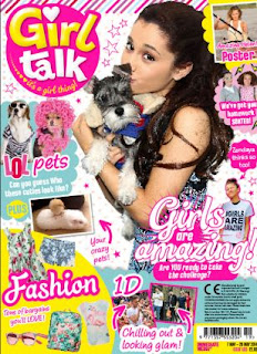
Format:     They are the design choices that are included in every issue to keep an overall consistency of the magazine. This includes colour scheme and font. For example, magazines aimed at young girls will most likely have pastel pinks and blues with doodles and sparkles all the way through the magazine and in every issue

For example 'girl talk'  has lots of pink and little doodles of love hearts and females on the cover which is featured in every single edition of the mag. (With exceptions to boy bands or actors that may be featured on the cover)


Formula: Editorial content (what's inside the mag) for example, article content, departments and their length. The address and the way the article is written will effect the audience. An adults magazine written like a child's magazine wouldn't work because people may think that the writer is insulting their intelligence and consequently the audience may lose interest in the magazine entirely and not buy it again.
 

As this example shows, its very clear just by the headlines which magazine is aimed at adults. The one on the right features mostly adult themes and cultures and is also mostly blocks of writing whereas the one on the left is much shorter and more fun and seems to be aimed towards the bands fans and young girls.
 

Frame: Margins and gutters are kept to a standard size to keep a familiarity and consistency in every issue of the magazine. The white space from the margins mean that it gives an eye break for the reader but also allows the reader to hold the publication without covering words. Without any white space at all the magazine would be very off-putting to the reader as it would look too overcrowded and time consuming to read. It'd be very difficult to escape a standardised margin layout whilst still having a good visual effect on the reader.
 
 
Function: What a magazine is trying to achieve. This can be the message it wants to convey to the reader whether that is fashion, music or political views. Other magazines that support wildlife could want people to volunteer for a charity for example.


Monday, 12 September 2016

Deconstruction of a school magazine

 
Deconstruction of a school magazine:


 Headline - Is in all caps in big, bold, black lettering  and shows the formality of the magazine as well as this, it is central and quickly attracts you to the title. Its short and snappy letting the reader know exactly what the magazine is about and what to expect from it                   
Image - This picture sets a tone for the magazine. It shows a high standard of uniform fitting with the sub line 'reflecting the best' as well as the engaged faces of the students to the teacher, it looks natural and shows their students as hardworking. This magazine is clearly aimed at adults because of the formality and language of the text. It's very minimalistic and would probably not entice the majority of younger generations
Overall - The magazine is clearly for middle to upper class parents because of the formality of the text and its stereotypical that they would have more involvement in the quality and standard of education of their children opposed to working class people.


This magazine is much different to the other. It seems to be aimed at a 'working class' average family. This is shown
in the use of colour and the less formal font and language used. It has a much more fun and welcoming vibe than the other and shows much more diversity on the cover however some of the language used like 'innovation' shows that
this magazine is aimed at adults and older readers rather than the child themselves. On the other hand, the magazine itself is based on choosing a secondary school, which, you would expect, the child would have some say in. This suggests that it may be a magazine aimed at the middle class as well. To further support this, the prices of magazines are rising therefore, it may be that wealthier families are the ones buying magazines but this magazine is trying to appeal to the masses rather than a niche group like the first one


Tuesday, 6 September 2016

The Task

Task:

                       1) Using DTP and an image manipulation program, produce the front page of a new school or college magazine featuring a medium close-up photograph of a student and some appropriately laid out text with a masthead. As well as this there must be a mock up of the layout of the contents page
      
                       2) Create a front page, contents and double page spread of a new music magazine